In this release we have focused on giving more insights at the first glance!
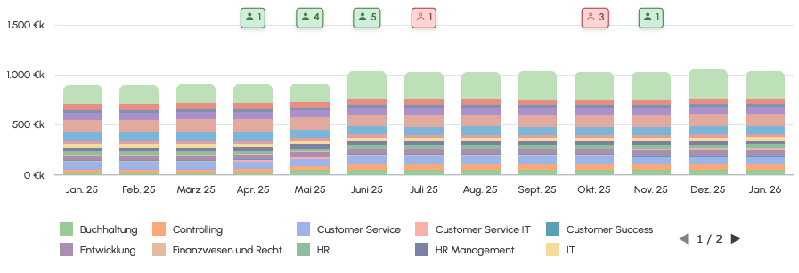
The scenario page shows a timeline of joiners/leavers directly integrated into your chart. To keep the chart clean, we show the number of joiners/leavers for each month. Those respect your chart settings, so when you filter for a certain department for example, it will show the joiners/leavers of that department only.
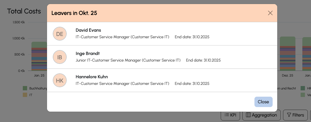
When clicking on one of these badges a popup lists all such employees behind it:
You new chart settings dropdown let's you chose between different display options, so you can control when you want them to be shown: Always, on mouse over, never
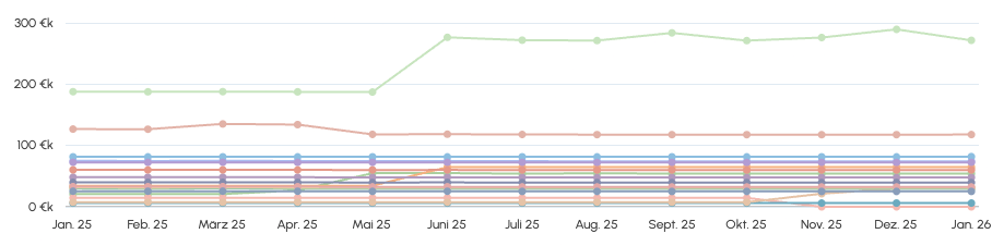
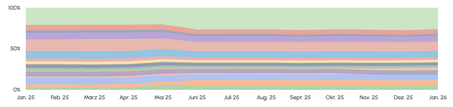
Speaking of new chart settings, we also provide two more chart types, each offering a new perspective to your costs. The current bar chart layout is best for seeing the total cost. The new line chart and area chart make it easier to spot cost drivers.
Line chart:
Area chart in percent:
Was this article helpful?
That’s Great!
Thank you for your feedback
Sorry! We couldn't be helpful
Thank you for your feedback
Feedback sent
We appreciate your effort and will try to fix the article